
Designing an application interface in today’s world is difficult. Many products offer native implementations for iOS and Android, as well as cross-browser HTML versions. Native platforms each offer their own user interface guidelines, which outline some best-practice approaches to navigation, controls, animations, and more. Apps that follow these guidelines are instantly understandable and usable by users. The best apps mix their own visual style into these guidelines, which makes the software feel like a natural extension of both the product’s brand and the host operating system.
Since the web is free and open, there are no specific UI guidelines in place. You can make your web app look however you like, and most products explicitly design every element on every page. This is highly recommended, as unstyled text and form elements are pretty ugly in all browsers:
It would be nice to borrow some principles of native apps, however, to make our web apps feel more native to the user’s operating system. The easiest way to accomplish this is by using system fonts that are specific to each platform. For example, take a look at this CSS system font stack used by Medium:
font-family: -apple-system, BlinkMacSystemFont, “Segoe UI”, “Roboto”, “Oxygen”, “Ubuntu”, “Cantarell”, “Fira Sans”, “Droid Sans”,”Helvetica Neue”, Arial, sans-serif;
This font declaration allows Medium to display headings using the appropriate system font for each operating system. Recent versions of OSX and iOS render headings in Apple’s new San Francisco font, Windows users see Segoe UI, Android users see Roboto, etc, and older devices fall back to Helvetica or Arial. It’s a nice subtle touch that’s easy to overlook, but since these fonts now match those used in each platform’s standard interface elements, it’s a great way to subconsciously make a website or web app feel more integrated into each user’s device.
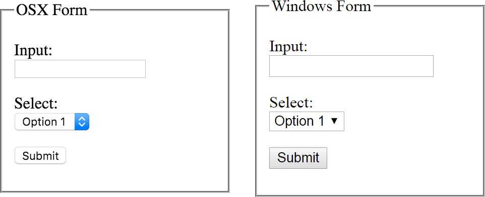
We experimented with using this system font approach for DoneDone’s header elements last year, but we felt it didn’t quite work with our design language. However, when we applied the system font stack to our form inputs, we loved it:
Previously, we used our body font (Adelle) for input fields, with mixed results. We found that the web font implementation of Adelle had some minor quirks across different browsers and platforms, mostly due to slight differences in line heights, vertical alignment, and antialiasing. Using the appropriate system font for each OS worked much better for us, as these rendered more consistently and cleanly.
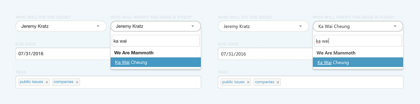
Although it was a simple change, it’s actually one of my favorite design decisions we’ve made with DoneDone. It may not work for every site or app design, but it’s a great default to start with when designing forms!